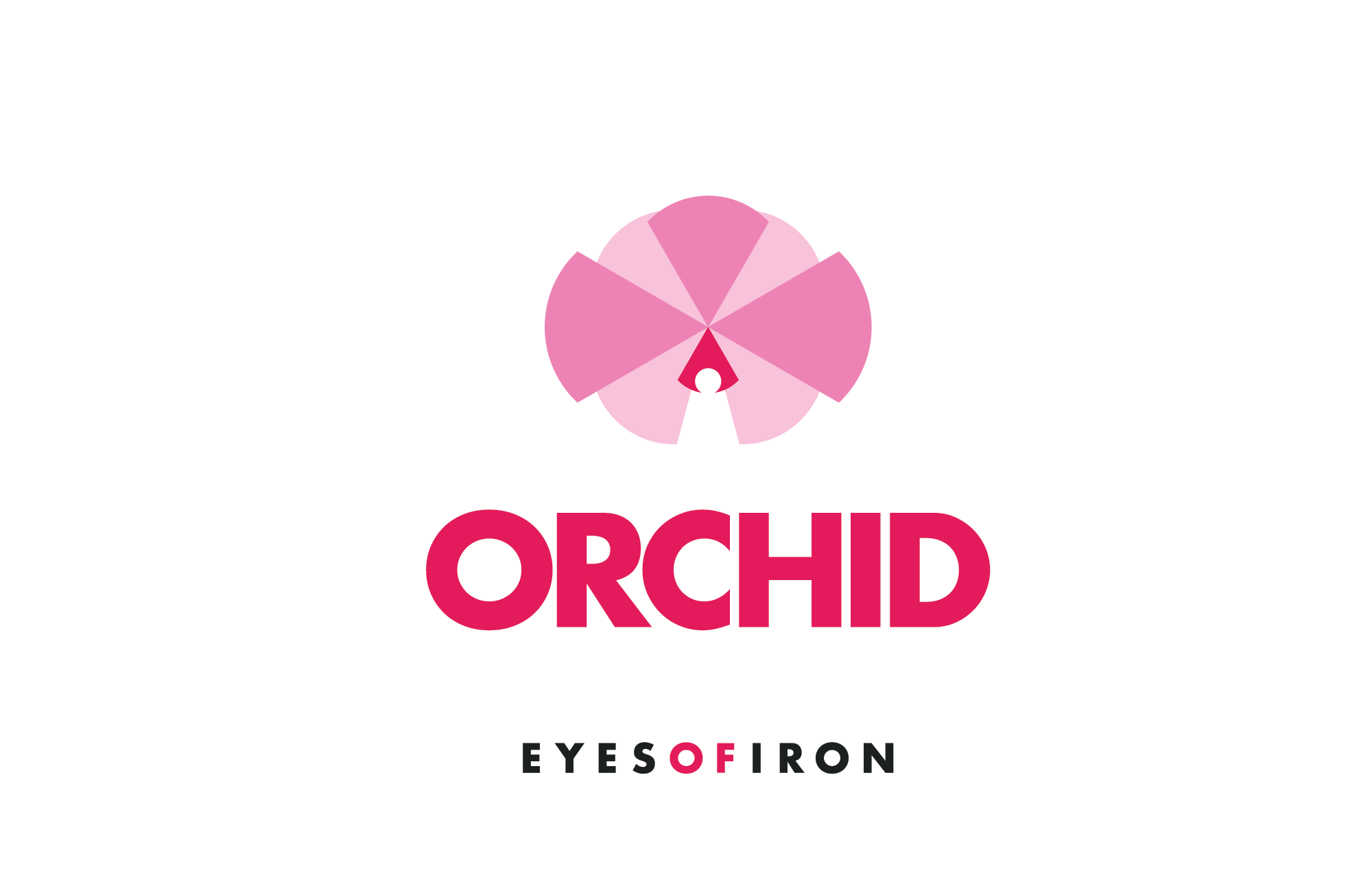
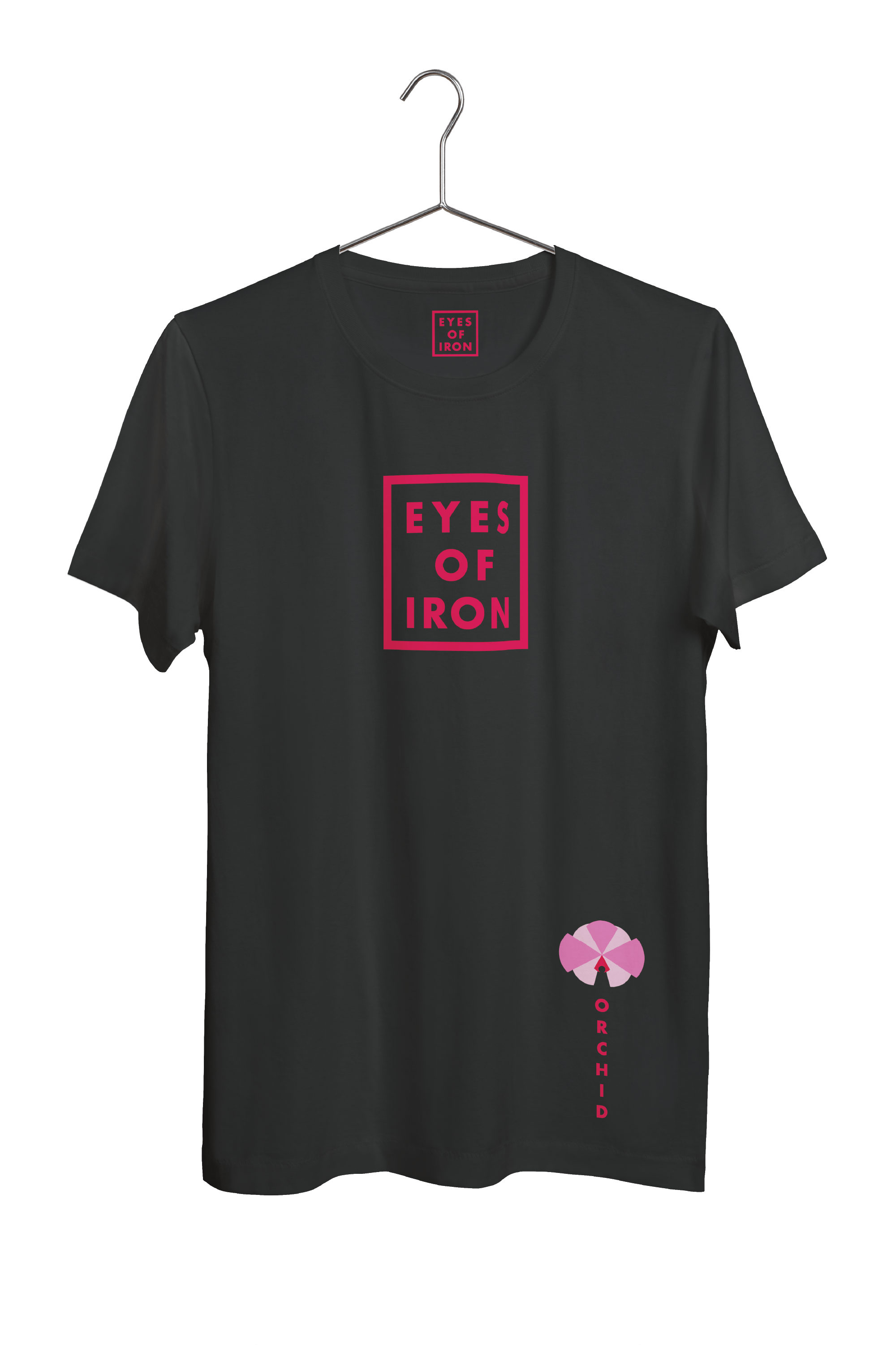
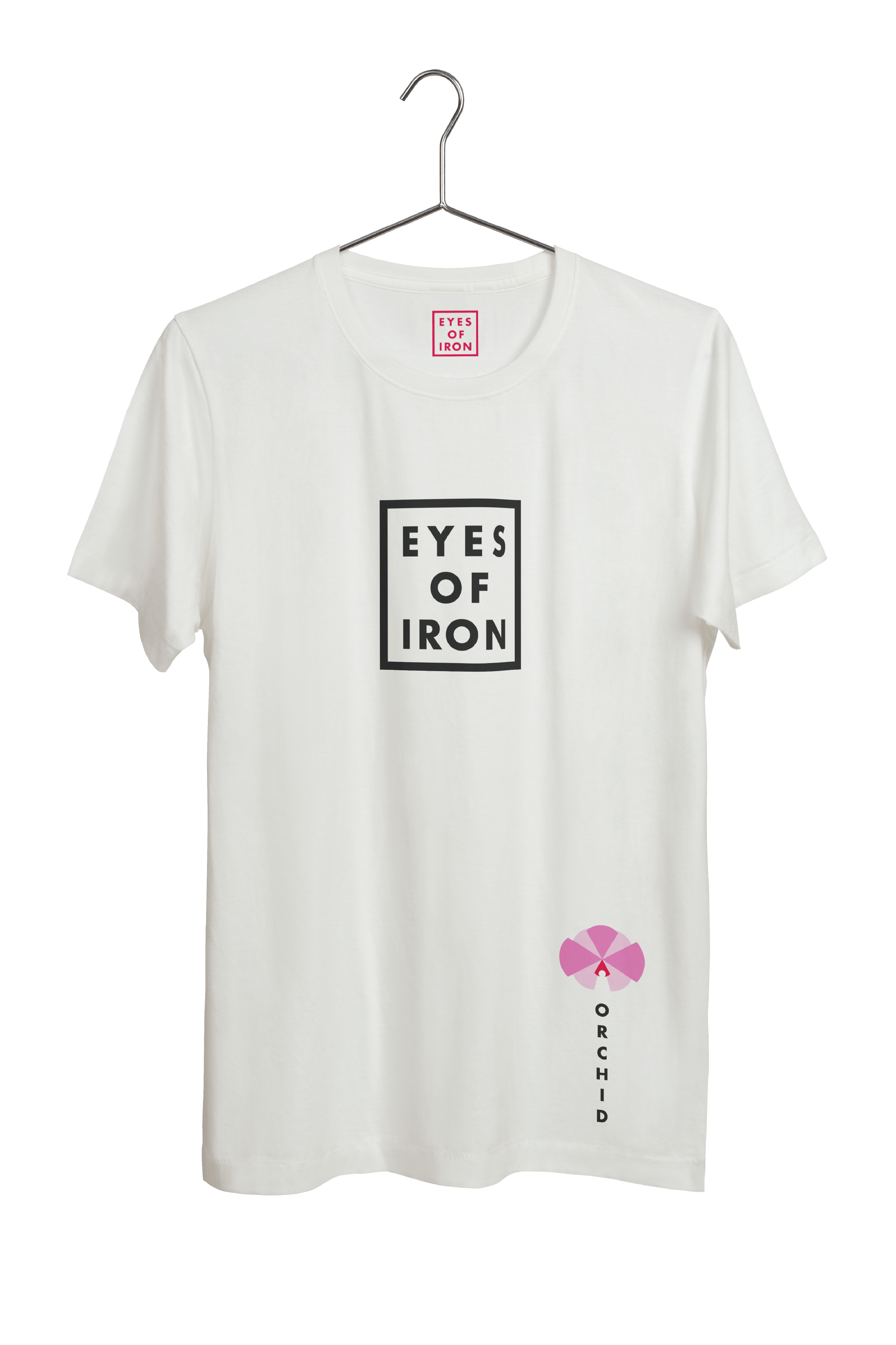
Eyes of Iron
Eyes of Iron is a digital-forward metal band with members located in Texas, Arkansas, and Scandinavia. They needed a visual identity to communicate their eerie and technical sound, including a brushed-up logo system, consistent color palette, and promotion of their new album, Orchid.


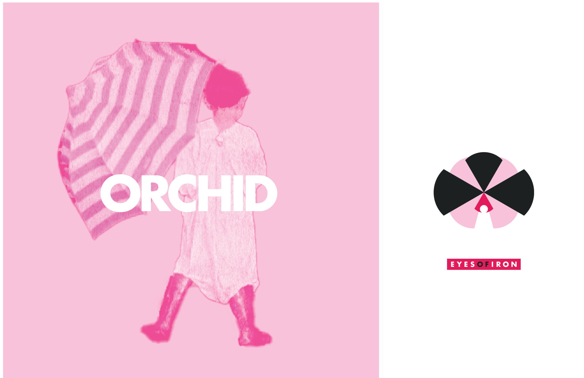
Inspired by nature
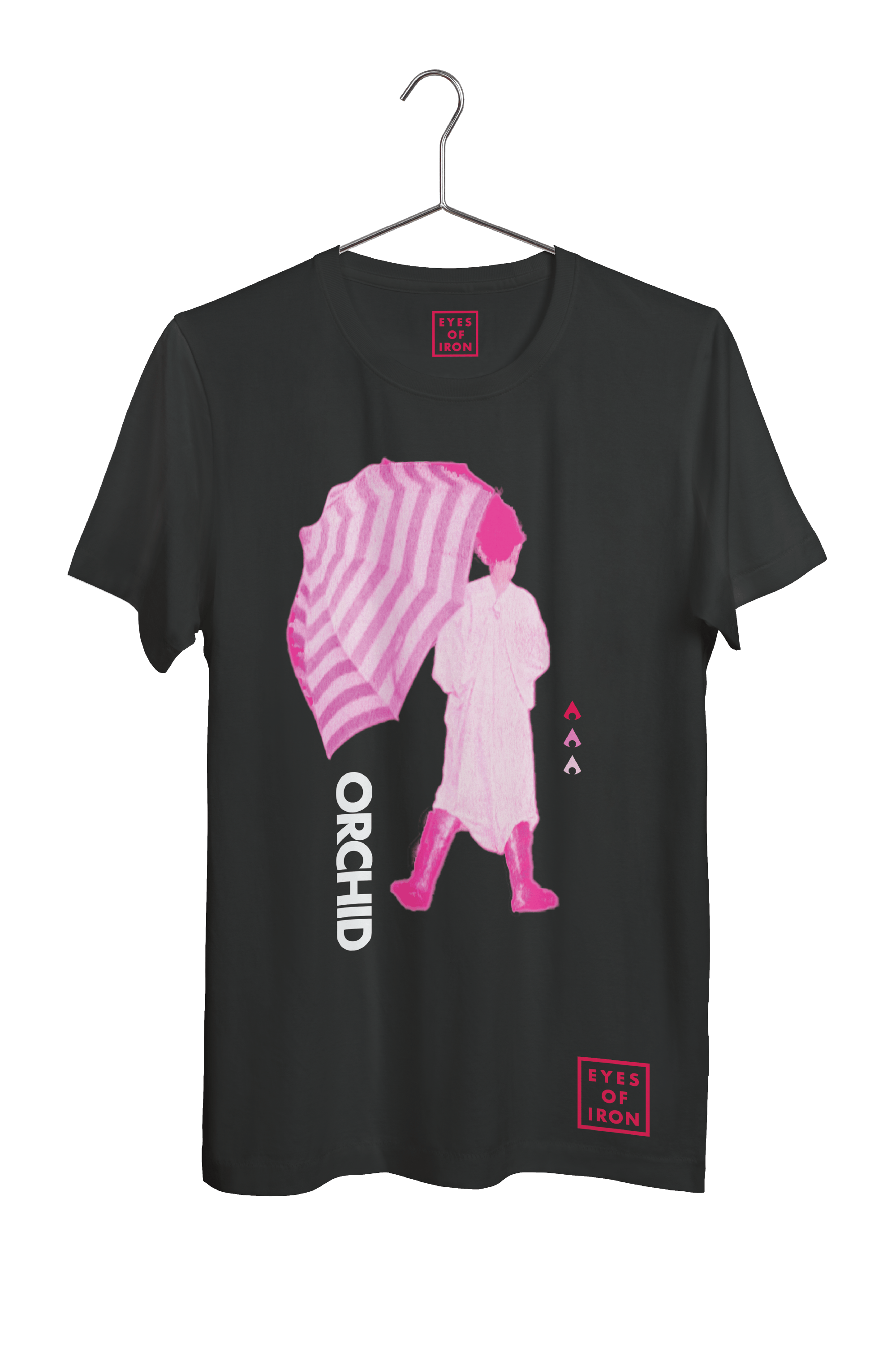
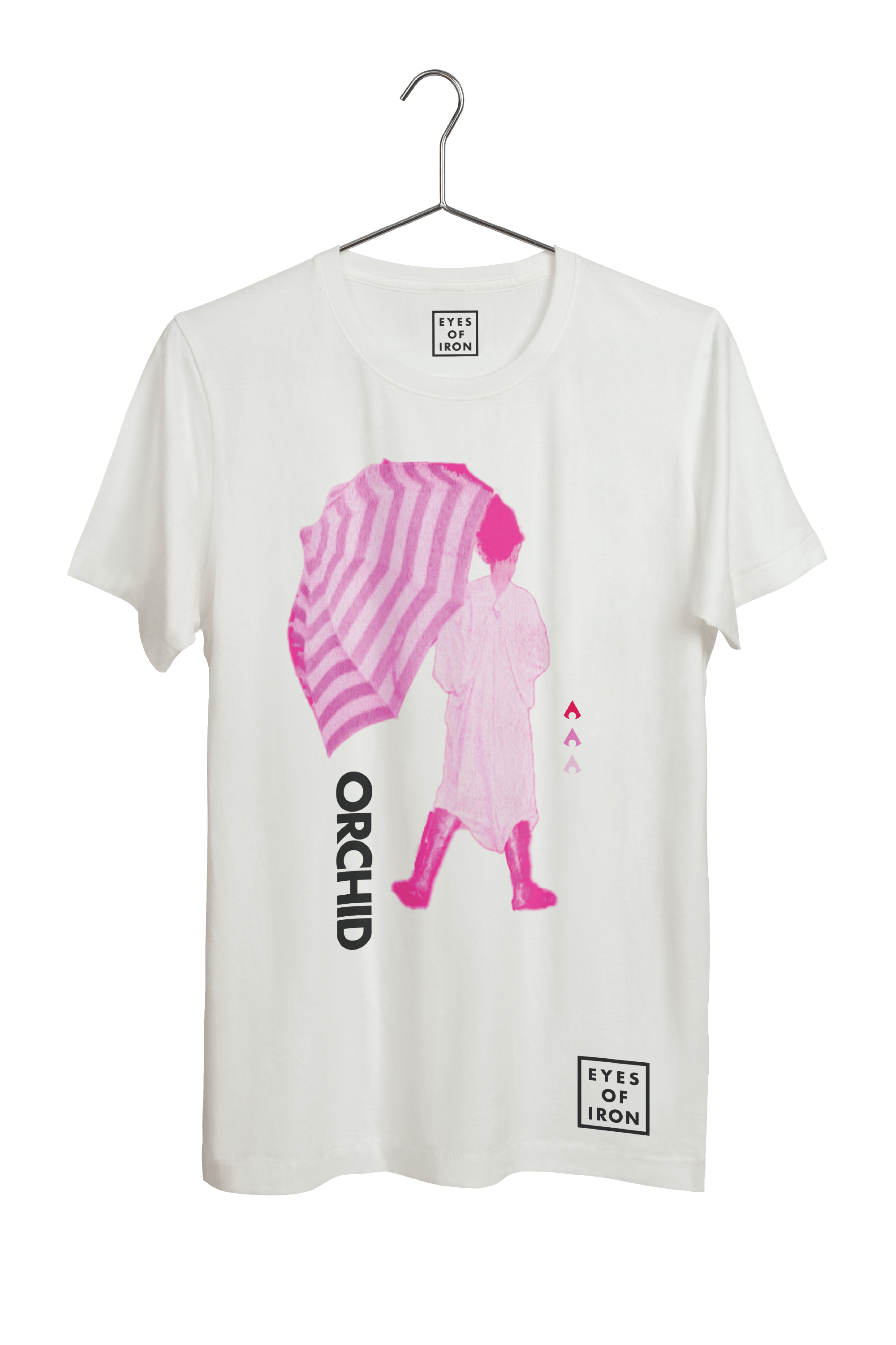
The original album art was inspired by a photo taken of his son by the lead guitarist. The entire visual identity was derived from the umbrella, with themes of hypnotic lines and a new ownable color we named “orchid pink”, taking cues from their album title.
Main word-mark in horizontal and square lock-ups.
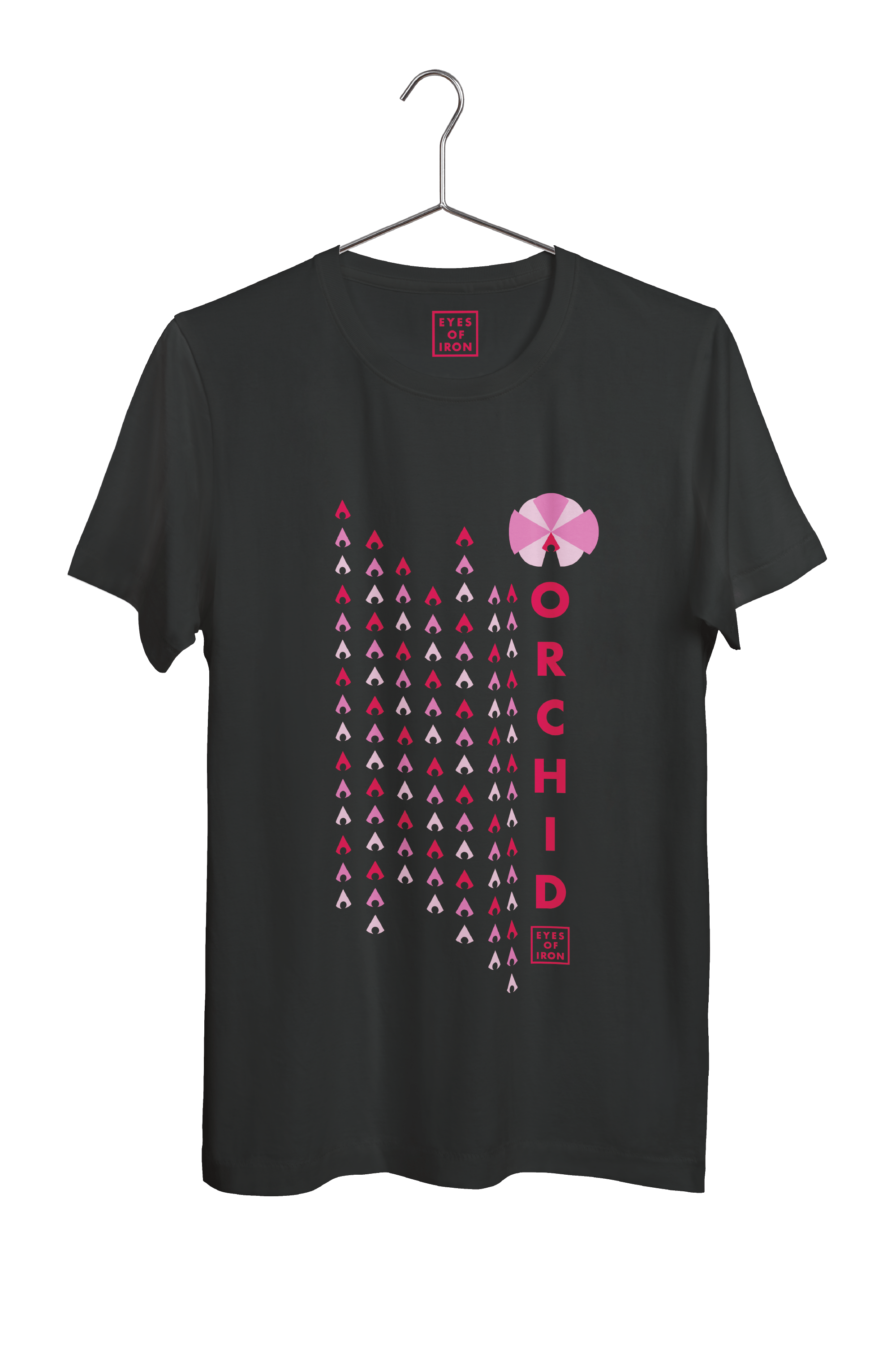
A symbol was created with the idea of connecting a sharp stone and an eye.


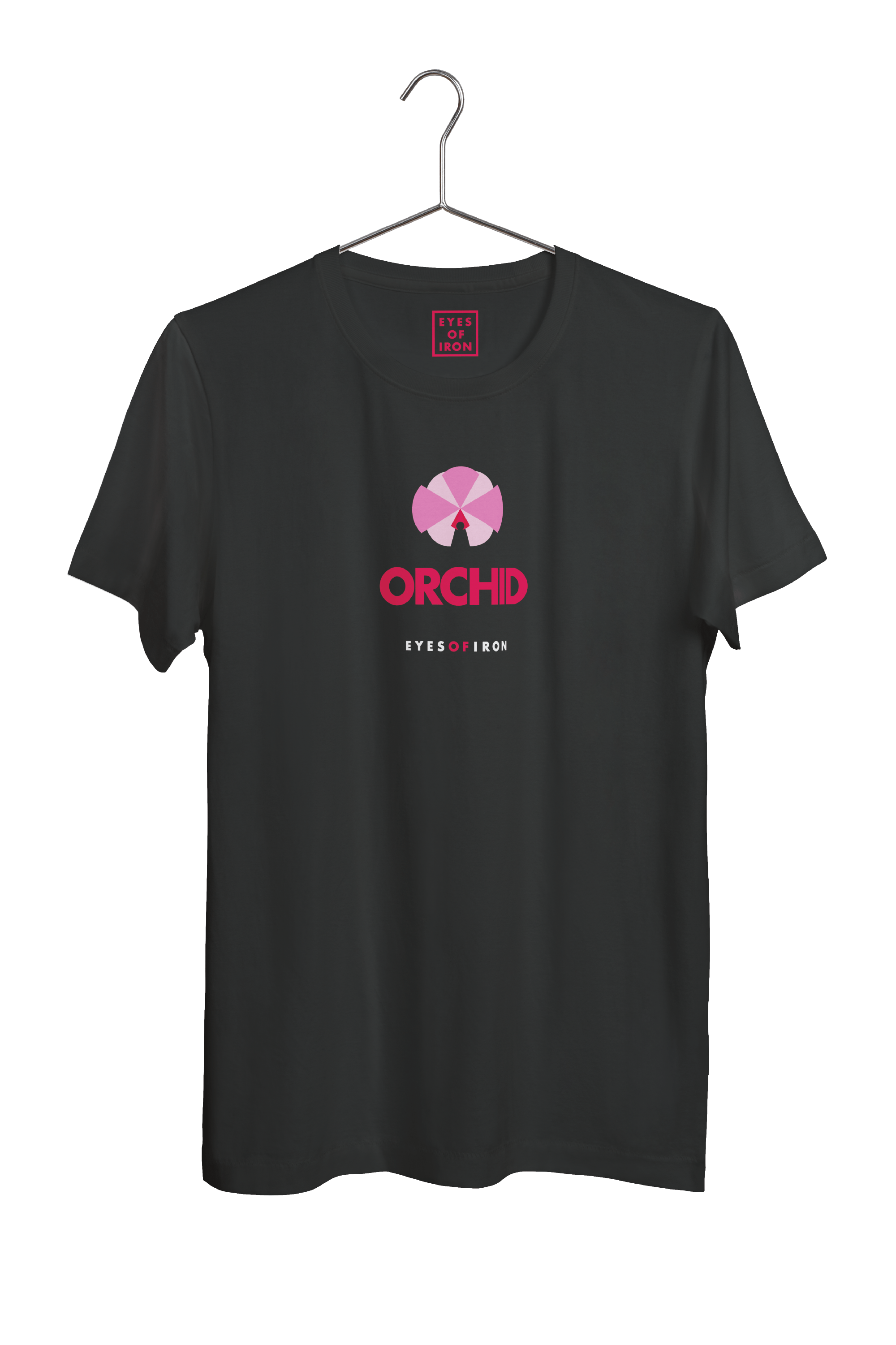
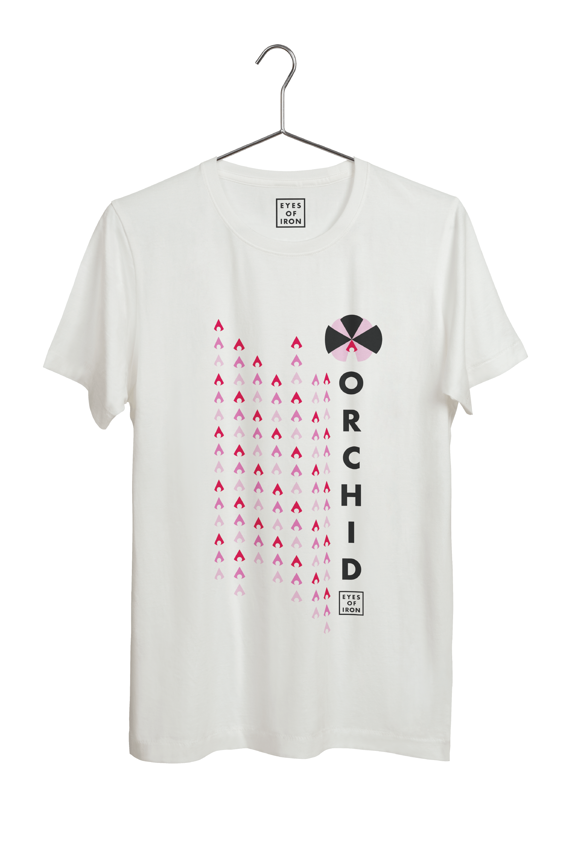
To uniquely identify the name of the album, an orchid was designed. The shapes of the petals were arranged from the eye symbol for recognition and consistency.